top of page


Simplifying the OP3N Experience: Intuitive Navigation for a Powerful Platform
Problem Statement
As we continue to enhance the OP3N experience by adding new functionalities, we faced a challenge of balancing empowerment and usability. The addition of numerous functions had the potential to confuse users and complicate their overall experience. Our goal was to empower users in their OP3N journey while ensuring seamless and intuitive navigation.
Process
Defining stages of User Journey
To improve the navigation experience and accurately empathize with our users, we defined and analyzed the stages of their navigation journey.
User Journey Map - Exploration
Actor
user of the OP3N platform who wants to find specific content related to a particular artist
Scenario + Expectations
The user is looking to explore products within the OP3N platform. They have a specific artist in mind and expect to easily find relevant content without spending excessive time searching.
Discovery
Filter
Exploration
Actions
Navigates to OP3N and selects the desired feature page
Utilizes filtering options to narrow down the content
Interacts with the filtered content and gathers information
Mindset
🧐 Curiosity and eagerness to explore relevant content
🎯 Seeking personalized and targeted results
🤔 Evaluating options and making informed decisions
Emotions
🥳 Anticipation, excitement
🧘 Determination, focus
☺️ Engagement, satisfaction
Opportunity
Ensure the main menu is prominently displayed for easy access to different feature pages.
Provide specialized filtering options, such as searching by artist name or category, for each feature page
Design an intuitive layout for product listings, presenting key information clearly and attractively
By understanding the user's actions, mindsets, and emotions throughout the user journey, we identified opportunities to improve users overall navigation on OP3N. These opportunities include enhancing the discovery and access phase, providing specialized filtering options for refinement, and designing an engaging layout for content exploration and selection.

🤔
User intention
Discovery
💡
Exploration
Filter Selection
Narrowing
🧐
Updated Content
Interaction
🥳
Solution
Final Outcome: Highlights
The final solution we developed for OP3N ensured a consistent alignment with users' goals at every stage of their navigation journey.

Mobile - Dark Mode

Desktop - Light Mode
User Journey: Discovery
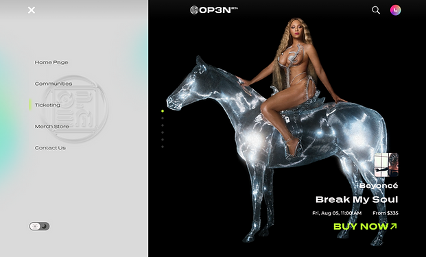
Main Menu
Problem
Users can't quickly access their intended content with the addition of new features
Solution
We introduced a main menu option at the top of the page, allowing users to navigate effortlessly between different features. This menu served as a central hub for accessing various sections of the platform, enhancing overall navigation efficiency.
User Journey: Explore
Shortcuts to Different Sections
Problem
Users need a quicker way to access different sections within a feature page
Solution
We implemented shortcuts on each main feature page, providing users with quick links to different sections such as featured content, trending items, or artist-specific sections. These shortcuts reduced the time required to reach desired content, improving user satisfaction.

Mobile - Dark Mode

Desktop - Light Mode

Merchandize - Home

User Journey: Filter Selection
Artist Name Filters
Problem
Users hope to quickly locate content by their preferred artists
Solution
We implemented the ability to filter products based on artist names. This feature catered to users who had a preference for particular artists or wanted to explore merchandise associated with their favorite creators. By providing this filtering option, we facilitated a more personalized and targeted browsing experience.
Merchandize - Filter by Artist
User Journey: Narrowing
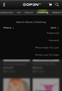
Categorical Product Filters
Problem
Users struggle to navigate and find specific product types within the merchandise page
Solution
We simplified product access by incorporating categorical filters, enabling users to easily navigate to specific product types such as accessories, art, decor, or clothing using the top tab menu. This streamlined approach saved users time and improved their shopping experience.


User Journey: Updated Content
Clear Navigation Feedback
Problem
sers can get disoriented or lose track when using multiple filters
Solution
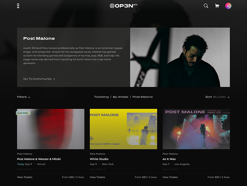
Users are informed about the page name and path above the product listing, ensuring a clear understanding of their current location within the platform. This way, even when users have applied multiple filters, they can easily track their progress and know the context of the displayed content.
bottom of page