top of page
OP3N
Design System
Created a design system to enhance work efficiency and ensure design consistency

About this project
During my work at EST Media, I have been involved in the full-cycle development of OP3N, a commerce and community platform that combines the essence of web2 and web3. As a new platform, OP3N is continually integrating new features for improvement, leading to extended design and development project sprints. In response to this challenge and to ensure consistent user experiences on the platform, I emphasized the need for a systematic solution and led the creation of a design system for OP3N.
MY ROLE
UIUX designer
TEAM
2 designers,
3 front-end developer
TOOLS
Figma, Zeplin
TYPE
Work
TIMELINE
Feb 2021 - Nov 2021
Design Question
How can we develop a consistent and comprehensively documented design system with standardized components and guidelines that enhances the user experience for our GenZ audience navigating our web3 platform and improves the working efficiency of our in-house designers and developers to ensure seamless collaboration across our cross-functional team?
WHAT
WHEN
WHO
How
WHY

Process
📑 Define & Document
We began with team meetings to define essential components for the documentation, establishing a foundation for the design system and outlining iterations to address OP3N's various problems.
🔄 Refine & Iterate
To ensure platform’s continuous growth and adaptability, we iteratively refine our design components based on best practices and new feature development.
👩🏻🏫 Share & Educate
We used a dedicated slack channel to to facilitate collaboration and knowledge sharing within the team in utilizing the components in expressing the brand value of OP3N.
Design Goal
Our design system contains comprehensive guidelines including typography, colors, small and large components, and general content guidelines. Created in Figma, the design system supports prototyping by utilizing variances and stages and aims to enhance the efficiency of our designers and developers, reducing development time.. With a clear, task-focused, and actionable approach, our design system ensures a coherent and consistent user experience, empowering users to easily navigate and interact with the platform.
🔍 Clear
We prioritize clear visual and textual cues, ensuring that users can easily comprehend the purpose and functionality of each component.
📋 Task-focused
Actionable components are strategically placed and clearly indicate their interactive nature, empowering users to perform desired tasks with ease.
✅ Actionable
All actionable components are designed to be visually distinguishable and placed in locations that are easily discoverable.
Solution
Final Outcome: Snippets of the design guideline
Each design system snippet provides a concise overview of the component, including its design, usage guidelines, purpose, and benefits.
Design Goal: Clear
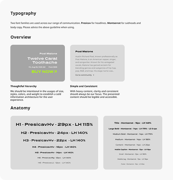
Typography: Thoughtful Hierarchy & Consistency
Solution
To showcase the brand value without compromising accessibility, we incorporated two typography styles. Prescia vHV for concise and impactful messaging, as well as Montserrat for longer paragraphs, ensuring clarity and readability. We defined clear guidelines for the usage of each typography, establishing a hierarchy that aids users in digesting information and promotes consistency across OP3N.
Design Goal: Clear
Color: Consistency & Accessibility
Solution
To maintain consistency across the platform, we developed a set of core colors that serve as the fundamental palette. Considering the presence of both dark and light modes, we placed a strong emphasis on ensuring color consistency while expressing the same brand vibe. Additionally, we prioritized accessibility by carefully selecting colors that maintain high contrast based on the WCAG standards.


Design Goal: Task Focused
General Content: Clear Actions & Consistency
Solution
In all assets, the content is task-focused, guiding users towards desired actions. Task-specific language is used to clearly communicate the purpose of each trigger and provide users with the necessary affordances. Content is align closely with other images and components, maintaining consistency. Additionally, we designed clear differentiation and hierarchy when multiple actions are present on a single page, allowing users to prioritize their tasks effectively.
Design Goal: Task-Focused
Cards:Uniformed Presentation & Familiarity
Solution
As e-commerce plays a significant role on the OP3N platform, we have developed a comprehensive set of cards to showcase various products. By maintaining a consistent design across the cards, we create a sense of familiarity for users. This allows them to quickly grasp and understand the information presented on the cards, enabling efficient browsing and decision-making.


Design Goal: Actionable
Drop Down: Clear Placement & Interactive Elements
Solution
Drop down tabs are strategically placed and easily located, allowing users to quickly access relevant content or functionality. Clear indications, such as visual cues or changes in button states, guide users to take further actions. To cater to users with varying levels of digital knowledge, drop down tabs may include both icons and text, enabling efficient interaction and providing clarity on the available options.

How it worked?
🙌🏼 We started building this design system as we were designing the first feature: Community for our new design version release. Since then, we've constantly expanded and refined the system as we design and develop new features.
👩🏻🎨 As the team's designer, I've experienced a significant acceleration in the design process through the utilization of our design system, leveraging established standards and readily available components. We imported designs into Zeplin for our engineers, and this additional step has proven worthwhile, as it fosters more effective collaboration with our tech team, requiring minimal effort on their part.
🧑🏻💻 In conversations with our frontend engineers, I gathered insights into their experiences with the design system. They mentioned the initial communication efforts and the extra time invested in ensuring components covering all potential edge cases. However, they do agree the design system made it easier to extend and reuse them across features, making the development process for new features more efficient and minimizing the need for back-and-forth communication.

bottom of page